This project stemmed from a desire to explore the vernacular typography found throughout the streets of Morelia, Michoacán, México. Researching this city from a typographic perspective was an incredible opportunity to honor my heritage and culture. I visit Mexico often and enjoy the rich artisanal culture, culinary delicacies, and family traditions.
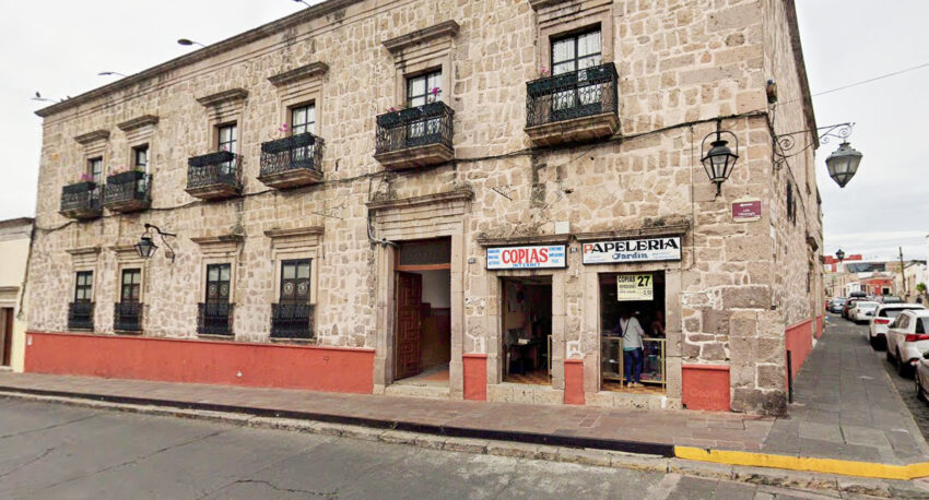
Google Maps Street View not only allowed me to virtually walk through the city’s streets, but also to study the typography of a region approximately 2,270 miles away. Through the careful examination of artisanal markets, business buildings and the shops in the Historic Center, I found over thirty handwritten signs, twenty-eight of which are presented in this book. There is one sign for each letter of the Spanish alphabet. The first two chapters of the book display common Mexican typographic traits. The last chapter covers the remaining letterforms that do not fall in a specific category. The front cover of the book was inspired by the popular handmade Mexican and Spanish pottery style: Talavera. While this style did not originate in Morelia, it portrays the country’s indigenous artistic legacy as a whole
The entire journey, from collecting signs, analyzing letters, and completing each page of the book, has been a learning process. Searching for each letter of the alphabet certainly strengthened my ability to identify handwritten typography and to categorize it by style. While gathering my research, I organized all twenty-eight different addresses, URLs, and descriptions in a practical format by letter.
During previous trips to Morelia, I had never noticed the vernacular typography around the city. I was surprised by the number of handwritten signs as well as the stylistic commonalities between them. Also, this project broadened my familiarity with typographic terms and the various aspects within a single letter. I found it surprising that there is very little firsthand research on the traditional typography of Morelia, one of the country’s major cities.
The most enjoyable part of the project was virtually visiting the Historic Center. I anticipate walking through the historic cobblestone roads and cathedrals when I visit in person. Incorporating my heritage and adding a personal twist to a university project, turned this assignment into a memorable undertaking.
About the Author: Diana Ramirez Carvallo

Diana is an undergraduate student at Nova Southeastern University majoring in business marketing with minors in graphic design and transdisciplinary studies. She is passionate about photography, traveling, and design. Minnesota-born and South Florida-raised, Diana enjoys spending time with her family and exploring the beautiful tropical landscapes in her community.
View the Project:
Wander Type: Morelia, Michoacán, México